UI / UX Design
Aurora Medical | Grammage
Reversing a sudden 70% spike in customer support calls by fixing critical UX debt inherited from an external agency's redesign.
Year :
2025
Role:
UX Designer
Industry :
Medical Cannabis
Client :
Aurora Medical
Project Duration :
3 weeks

The Executive Summary
Shortly after an external agency launched a visual redesign of the Aurora Medical e-commerce platform, the business faced an operational crisis. Client Care reported a ~70% increase in support calls directly related to patients being unable to find or understand their legally mandated prescription limits (grammage).
In a highly regulated medical environment, prescription visibility isn't a UI preference; it is a strict legal and safety requirement. Patients need this data to make informed purchases and avoid checkout blockages. I was brought in to diagnose the root cause and execute a rapid, high-impact structural fix within a 3-week window, navigating strict industry constraints that prevented standard pre-launch user testing.
By shifting the platform's architecture from reactive error-handling to proactive system status visibility, I successfully reversed the call volume spike, restored patient trust, and re-established operational efficiency.

Strategic Constraints & Approach
Executing a successful intervention required adapting standard UX methodologies to fit an emergency timeline and strict industry regulations.
Aggressive 3-Week SLA: The immediate operational cost of the support call spike required a rapid diagnosis, design, and developer handoff.
Regulatory Research Barriers: Strict medical privacy laws in the cannabis sector made recruiting active patients for live, pre-launch moderated testing impossible within the timeline.
Agile Triangulation: To bypass these barriers safely, I triangulated data using qualitative proxies (interviewing Client Care agents as the "voice of the user") and conducted a rigorous heuristic evaluation against Nielsen’s principles to isolate the exact points of friction.
UX Audit: Diagnosing the Inherited UX Debt:
Before designing a solution, I needed to understand exactly why the external agency’s recent redesign and the platform’s legacy features were failing our patients. I identified that prescription awareness was being introduced entirely too late in the user journey.
I isolated three critical failures in the existing architecture:
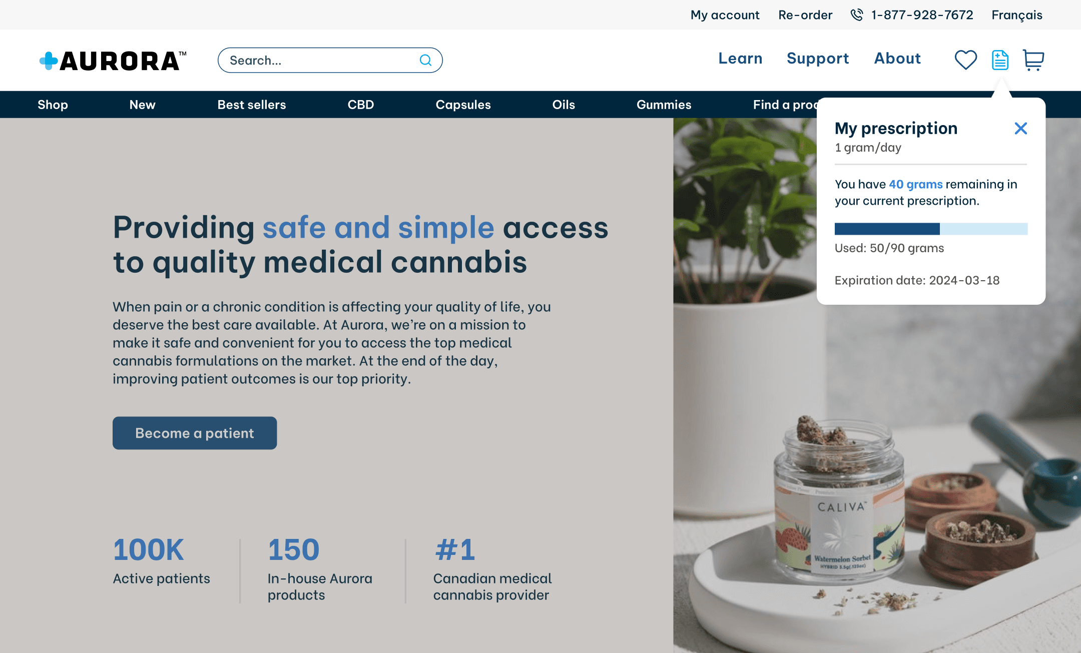
The Agency Desktop Flaw (Hidden System Status): The agency had buried critical grammage data behind a desktop-only hover icon. This violated the Visibility of System Status heuristic. Patients only discovered their limits by accidental interaction or by being hard-blocked at checkout.
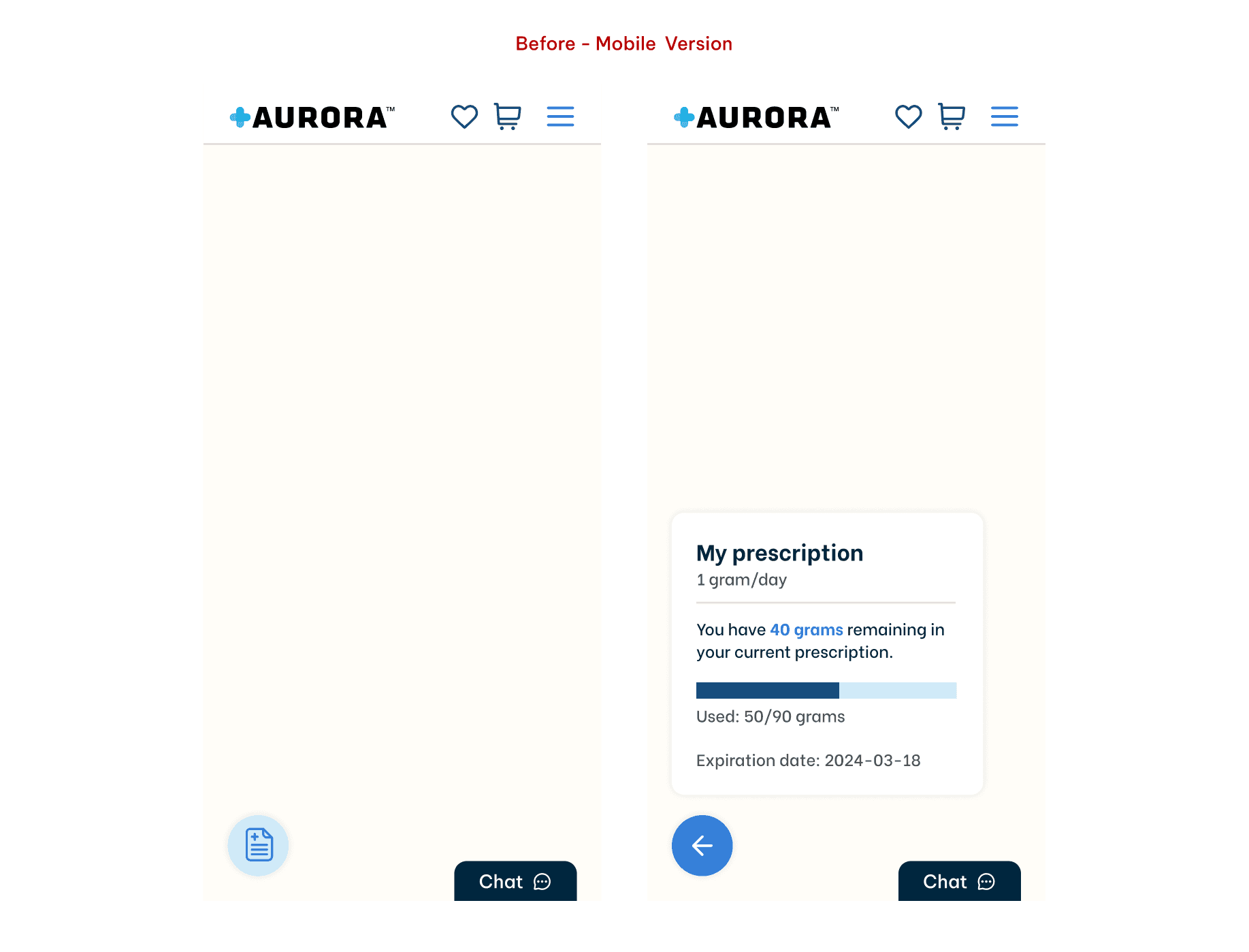
The Agency Mobile Flaw (The Dismissible Widget): To save screen real estate, the agency implemented a floating widget at the bottom of the mobile screen. Because it visually mimicked a promotional pop-up or chat bubble, users instinctively dismissed it, accidentally deleting their own medical data from view.
The Legacy Fallback (Reactive Error Handling): The platform relied on a pre-existing warning banner inside the shopping cart if a user exceeded their limit. Relying on this as the primary feedback loop was too reactive, forcing users to interrupt their browsing just to check their status. (Strategic Decision: I opted to retain this feature strictly as a secondary, failsafe safety net).
The Persona Complexity: The hidden system caused friction for Civilian patients tracking standard allowances, but created compounded, severe confusion for Veterans, who had to simultaneously interpret complex VAC-related financial coverage data.
The Solution: Proactive Guidance & Persistent Visibility
My strategy required a fundamental shift: move the experience away from hidden, interaction-dependent UI and reactive errors, and toward persistent, system-level visibility.
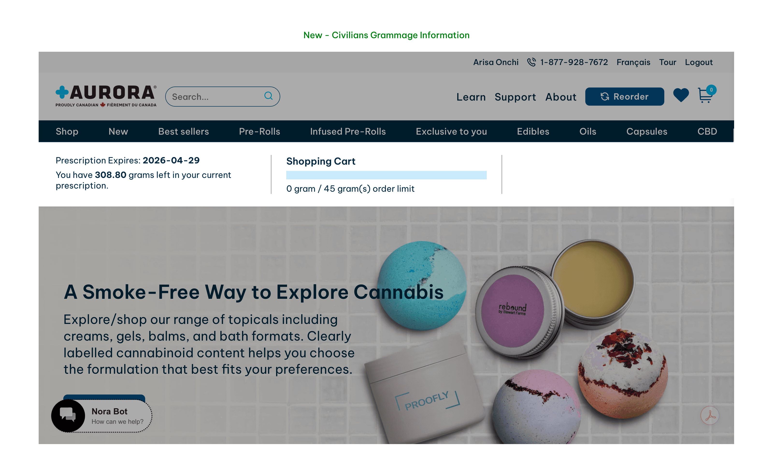
1. Embedded Global Header (Universal Visibility) I integrated the prescription expiration date and total remaining grammage directly into the top-left global sub-header.
Scalable Data Architecture: For Veterans, I introduced VAC coverage as a seamless third column. This ensured complex edge cases were accommodated without overwhelming Civilian users with irrelevant data.
Accessibility First: This eliminated the exclusionary desktop hover dependency and permanently replaced the easily dismissed mobile widget.
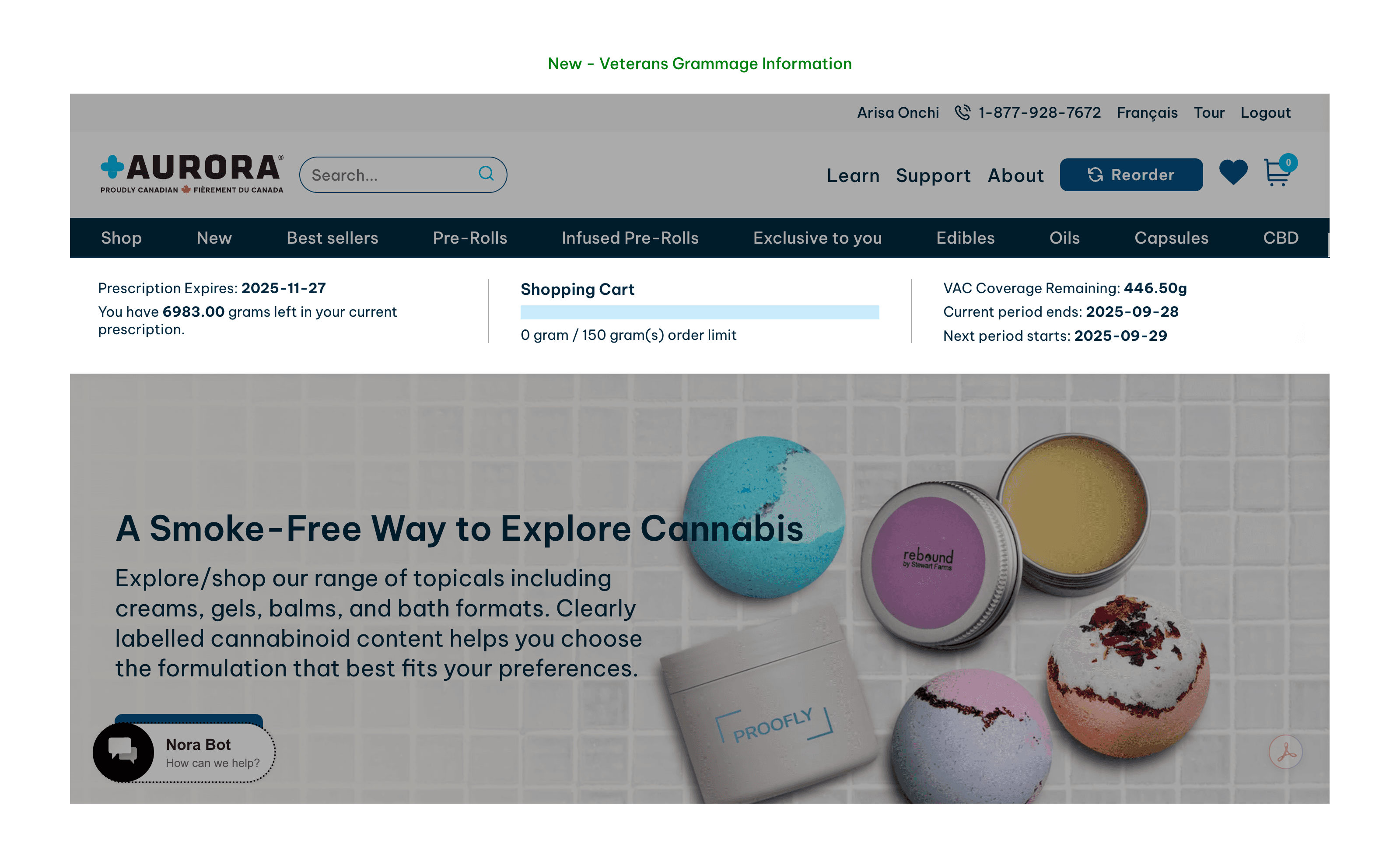
2. Real-Time Grammage Progress Indicator I introduced a visual progress meter within the shopping cart that reacted dynamically as items were added.
Behavioural Feedback: This provided immediate, proactive guidance, allowing patients to adjust quantities on the fly rather than hitting a frustrating wall at checkout.
Validation & Business Impact
Because strict regulations prevented pre-launch quantitative testing, post-launch qualitative validation was critical to ensure the structural changes solved the user anxiety.
The Post-Launch Patient Focus Group. Immediately following the launch, I facilitated an in-person focus group with 10 verified patients to validate the usability of the new architecture.
The Verdict: The reception was overwhelmingly positive. Patients explicitly validated that the new persistent grammar UI looked clear and provided all the necessary medical and financial information exactly where they expected to find it, eliminating their previous purchasing anxiety.
The Business Outcome:
The strategic redesign achieved its primary objective: Support calls related to prescription confusion plummeted immediately post-launch, fully reversing the previous 70% spike. We reduced checkout friction, stabilized an operational crisis, and restored a confident, safe purchasing environment for our patients.
Cross-Functional Execution & Takeaways
Collaborative Delivery:
Because of the aggressive 3-week timeline, operating in a silo was not an option. I partnered closely with the E-commerce Strategist and Senior Marketing Manager to ensure the new persistent header aligned with the broader business strategy and didn't disrupt other marketing initiatives.
Finally, I worked directly with the Front-end Developers to ensure a smooth, rapid handoff, guaranteeing the real-time cart progress bar was technically feasible within our emergency window.
Reflection:
This project reinforced the importance of transparent, accessible design in regulated environments. By moving prescription information from a hidden interaction to a persistent, real-time system alongside a dedicated cross-functional team, we reduced user friction, restored patient confidence, and solved a critical business bottleneck under extreme constraints.
More Projects
More Projects


UI / UX Design
Aurora Medical | Grammage
Reversing a sudden 70% spike in customer support calls by fixing critical UX debt inherited from an external agency's redesign.
Year :
2025
Role:
UX Designer
Industry :
Medical Cannabis
Client :
Aurora Medical
Project Duration :
3 weeks
The Executive Summary
Shortly after an external agency launched a visual redesign of the Aurora Medical e-commerce platform, the business faced an operational crisis. Client Care reported a ~70% increase in support calls directly related to patients being unable to find or understand their legally mandated prescription limits (grammage).
In a highly regulated medical environment, prescription visibility isn't a UI preference; it is a strict legal and safety requirement. Patients need this data to make informed purchases and avoid checkout blockages. I was brought in to diagnose the root cause and execute a rapid, high-impact structural fix within a 3-week window, navigating strict industry constraints that prevented standard pre-launch user testing.
By shifting the platform's architecture from reactive error-handling to proactive system status visibility, I successfully reversed the call volume spike, restored patient trust, and re-established operational efficiency.
Strategic Constraints & Approach
Executing a successful intervention required adapting standard UX methodologies to fit an emergency timeline and strict industry regulations.
Aggressive 3-Week SLA: The immediate operational cost of the support call spike required a rapid diagnosis, design, and developer handoff.
Regulatory Research Barriers: Strict medical privacy laws in the cannabis sector made recruiting active patients for live, pre-launch moderated testing impossible within the timeline.
Agile Triangulation: To bypass these barriers safely, I triangulated data using qualitative proxies (interviewing Client Care agents as the "voice of the user") and conducted a rigorous heuristic evaluation against Nielsen’s principles to isolate the exact points of friction.
UX Audit: Diagnosing the Inherited UX Debt:
Before designing a solution, I needed to understand exactly why the external agency’s recent redesign and the platform’s legacy features were failing our patients. I identified that prescription awareness was being introduced entirely too late in the user journey.
I isolated three critical failures in the existing architecture:
The Agency Desktop Flaw (Hidden System Status): The agency had buried critical grammage data behind a desktop-only hover icon. This violated the Visibility of System Status heuristic. Patients only discovered their limits by accidental interaction or by being hard-blocked at checkout.
The Agency Mobile Flaw (The Dismissible Widget): To save screen real estate, the agency implemented a floating widget at the bottom of the mobile screen. Because it visually mimicked a promotional pop-up or chat bubble, users instinctively dismissed it, accidentally deleting their own medical data from view.
The Legacy Fallback (Reactive Error Handling): The platform relied on a pre-existing warning banner inside the shopping cart if a user exceeded their limit. Relying on this as the primary feedback loop was too reactive, forcing users to interrupt their browsing just to check their status. (Strategic Decision: I opted to retain this feature strictly as a secondary, failsafe safety net).
The Persona Complexity: The hidden system caused friction for Civilian patients tracking standard allowances, but created compounded, severe confusion for Veterans, who had to simultaneously interpret complex VAC-related financial coverage data.
The Solution: Proactive Guidance & Persistent Visibility
My strategy required a fundamental shift: move the experience away from hidden, interaction-dependent UI and reactive errors, and toward persistent, system-level visibility.
1. Embedded Global Header (Universal Visibility) I integrated the prescription expiration date and total remaining grammage directly into the top-left global sub-header.
Scalable Data Architecture: For Veterans, I introduced VAC coverage as a seamless third column. This ensured complex edge cases were accommodated without overwhelming Civilian users with irrelevant data.
Accessibility First: This eliminated the exclusionary desktop hover dependency and permanently replaced the easily dismissed mobile widget.
2. Real-Time Grammage Progress Indicator I introduced a visual progress meter within the shopping cart that reacted dynamically as items were added.
Behavioural Feedback: This provided immediate, proactive guidance, allowing patients to adjust quantities on the fly rather than hitting a frustrating wall at checkout.
Validation & Business Impact
Because strict regulations prevented pre-launch quantitative testing, post-launch qualitative validation was critical to ensure the structural changes solved the user anxiety.
The Post-Launch Patient Focus Group. Immediately following the launch, I facilitated an in-person focus group with 10 verified patients to validate the usability of the new architecture.
The Verdict: The reception was overwhelmingly positive. Patients explicitly validated that the new persistent grammar UI looked clear and provided all the necessary medical and financial information exactly where they expected to find it, eliminating their previous purchasing anxiety.
The Business Outcome:
The strategic redesign achieved its primary objective: Support calls related to prescription confusion plummeted immediately post-launch, fully reversing the previous 70% spike. We reduced checkout friction, stabilized an operational crisis, and restored a confident, safe purchasing environment for our patients.
Cross-Functional Execution & Takeaways
Collaborative Delivery:
Because of the aggressive 3-week timeline, operating in a silo was not an option. I partnered closely with the E-commerce Strategist and Senior Marketing Manager to ensure the new persistent header aligned with the broader business strategy and didn't disrupt other marketing initiatives.
Finally, I worked directly with the Front-end Developers to ensure a smooth, rapid handoff, guaranteeing the real-time cart progress bar was technically feasible within our emergency window.
Reflection:
This project reinforced the importance of transparent, accessible design in regulated environments. By moving prescription information from a hidden interaction to a persistent, real-time system alongside a dedicated cross-functional team, we reduced user friction, restored patient confidence, and solved a critical business bottleneck under extreme constraints.
More Projects
More Projects
UI / UX Design
Aurora Medical | Grammage
Reversing a sudden 70% spike in customer support calls by fixing critical UX debt inherited from an external agency's redesign.
Year :
2025
Role:
UX Designer
Industry :
Medical Cannabis
Client :
Aurora Medical
Project Duration :
3 weeks
The Executive Summary
Shortly after an external agency launched a visual redesign of the Aurora Medical e-commerce platform, the business faced an operational crisis. Client Care reported a ~70% increase in support calls directly related to patients being unable to find or understand their legally mandated prescription limits (grammage).
In a highly regulated medical environment, prescription visibility isn't a UI preference; it is a strict legal and safety requirement. Patients need this data to make informed purchases and avoid checkout blockages. I was brought in to diagnose the root cause and execute a rapid, high-impact structural fix within a 3-week window, navigating strict industry constraints that prevented standard pre-launch user testing.
By shifting the platform's architecture from reactive error-handling to proactive system status visibility, I successfully reversed the call volume spike, restored patient trust, and re-established operational efficiency.
Strategic Constraints & Approach
Executing a successful intervention required adapting standard UX methodologies to fit an emergency timeline and strict industry regulations.
Aggressive 3-Week SLA: The immediate operational cost of the support call spike required a rapid diagnosis, design, and developer handoff.
Regulatory Research Barriers: Strict medical privacy laws in the cannabis sector made recruiting active patients for live, pre-launch moderated testing impossible within the timeline.
Agile Triangulation: To bypass these barriers safely, I triangulated data using qualitative proxies (interviewing Client Care agents as the "voice of the user") and conducted a rigorous heuristic evaluation against Nielsen’s principles to isolate the exact points of friction.
UX Audit: Diagnosing the Inherited UX Debt:
Before designing a solution, I needed to understand exactly why the external agency’s recent redesign and the platform’s legacy features were failing our patients. I identified that prescription awareness was being introduced entirely too late in the user journey.
I isolated three critical failures in the existing architecture:
The Agency Desktop Flaw (Hidden System Status): The agency had buried critical grammage data behind a desktop-only hover icon. This violated the Visibility of System Status heuristic. Patients only discovered their limits by accidental interaction or by being hard-blocked at checkout.
The Agency Mobile Flaw (The Dismissible Widget): To save screen real estate, the agency implemented a floating widget at the bottom of the mobile screen. Because it visually mimicked a promotional pop-up or chat bubble, users instinctively dismissed it, accidentally deleting their own medical data from view.
The Legacy Fallback (Reactive Error Handling): The platform relied on a pre-existing warning banner inside the shopping cart if a user exceeded their limit. Relying on this as the primary feedback loop was too reactive, forcing users to interrupt their browsing just to check their status. (Strategic Decision: I opted to retain this feature strictly as a secondary, failsafe safety net).
The Persona Complexity: The hidden system caused friction for Civilian patients tracking standard allowances, but created compounded, severe confusion for Veterans, who had to simultaneously interpret complex VAC-related financial coverage data.
The Solution: Proactive Guidance & Persistent Visibility
My strategy required a fundamental shift: move the experience away from hidden, interaction-dependent UI and reactive errors, and toward persistent, system-level visibility.
1. Embedded Global Header (Universal Visibility) I integrated the prescription expiration date and total remaining grammage directly into the top-left global sub-header.
Scalable Data Architecture: For Veterans, I introduced VAC coverage as a seamless third column. This ensured complex edge cases were accommodated without overwhelming Civilian users with irrelevant data.
Accessibility First: This eliminated the exclusionary desktop hover dependency and permanently replaced the easily dismissed mobile widget.
2. Real-Time Grammage Progress Indicator I introduced a visual progress meter within the shopping cart that reacted dynamically as items were added.
Behavioural Feedback: This provided immediate, proactive guidance, allowing patients to adjust quantities on the fly rather than hitting a frustrating wall at checkout.
Validation & Business Impact
Because strict regulations prevented pre-launch quantitative testing, post-launch qualitative validation was critical to ensure the structural changes solved the user anxiety.
The Post-Launch Patient Focus Group. Immediately following the launch, I facilitated an in-person focus group with 10 verified patients to validate the usability of the new architecture.
The Verdict: The reception was overwhelmingly positive. Patients explicitly validated that the new persistent grammar UI looked clear and provided all the necessary medical and financial information exactly where they expected to find it, eliminating their previous purchasing anxiety.
The Business Outcome:
The strategic redesign achieved its primary objective: Support calls related to prescription confusion plummeted immediately post-launch, fully reversing the previous 70% spike. We reduced checkout friction, stabilized an operational crisis, and restored a confident, safe purchasing environment for our patients.
Cross-Functional Execution & Takeaways
Collaborative Delivery:
Because of the aggressive 3-week timeline, operating in a silo was not an option. I partnered closely with the E-commerce Strategist and Senior Marketing Manager to ensure the new persistent header aligned with the broader business strategy and didn't disrupt other marketing initiatives.
Finally, I worked directly with the Front-end Developers to ensure a smooth, rapid handoff, guaranteeing the real-time cart progress bar was technically feasible within our emergency window.
Reflection:
This project reinforced the importance of transparent, accessible design in regulated environments. By moving prescription information from a hidden interaction to a persistent, real-time system alongside a dedicated cross-functional team, we reduced user friction, restored patient confidence, and solved a critical business bottleneck under extreme constraints.